


News
17.11.2021
"We want to bring our internal attitude to the outside world" - RTL's brand development over time
by Alexandra Runden, Eyes & Ears of Europe
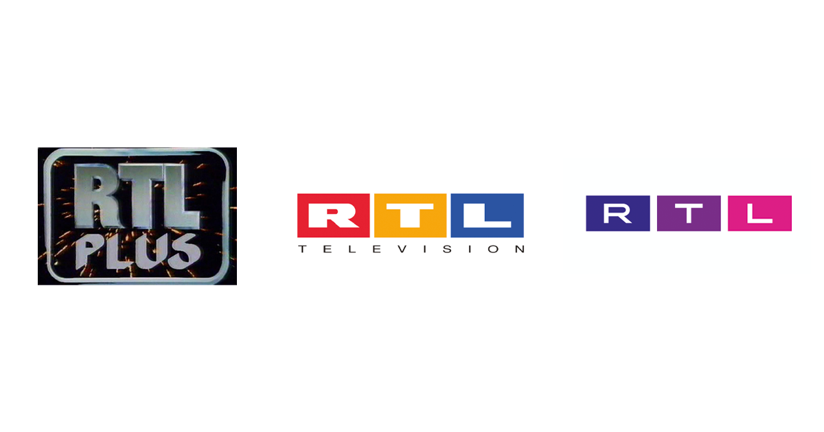
Since 2 January 1984, exactly one day after SAT.1, "Radio Television Luxemburg" can be received in Germany. From 1 January 1988, RTL plus began broadcasting from Cologne, where the station was given its permanent colours of red, yellow and blue just one year later. These three colours have been firmly associated with the channel ever since - but the redesign in September 2021 has now changed that: The familiar boxes remain, but the three RTL colours do not. We spoke to Frederik Geisler, Creative Director RTL Germany, about the background leading to this decision and how it has grown historically. Manfred Becker, former Creative Director/Head of Presentation RTL and Honorary President of Eyes & Ears of Europe, also has his say. Here is part 2 of the series "Brand development over time" on the occasion of the 25th anniversary of Eyes & Ears of Europe.
In September, the RTL colours came to an end. After more than 20 years of red, yellow and blue, the channel has now opened its logo boxes to all the colours of the rainbow. It was a big step that required employees and viewers to get used to the new colours, but it had to be taken because of a change of heart on the inside. "The starting point was not a redesign per se. Not pure l'art pour l'art. We didn't say, 'Okay, let's finally get rid of the red, yellow and blue' or 'Let's do something new'," emphasises Frederik Geisler, who became Creative Director of RTL Germany this year. "Quite the opposite! We were also open about that from the very beginning. In fact, the redesign came out of an inner transformation." Because just as the world and society have changed politically, ecologically and geopolitically, so has RTL. "We felt that now was the time to take responsibility. And yes, I know that sounds strange at first for a channel like RTL. After all, we tend to stand for a bit of escapism, and we like to be labelled as a thoughtless entertainment broadcaster in the process," Geisler continues, anticipating the next question. "But the RTL brand has permeated our diverse society and also reaches those who feel unheard by the so-called quality media. As the spokesperson for the people, the channel should also reflect their diversity. With the new logo, we wanted to create a symbol for this transformation and at the same time clean up the very fragmented brand image, paving the way for a one-brand appearance."

Three boxes with endless possibilities
Despite all the changes, the new logo is also a nod to the station's past, as the current Creative Director emphasises several times. That's why not everything was changed in this redesign, meaning that you can still find familiar things: After all, the logo with the three boxes in red, yellow, blue, which were first introduced in 1992, still has a high level of consistency today and thus stands out from other broadcasters such as SAT.1. "There were really only minimal changes here [in the history]: the boxes first moved a little further away, then they moved closer together just to move away again later," Geisler reflects. "Of course, the materiality has also changed depending on the trend, as has the scale of the boxes. But basically the logo has remained the same since 1992: The same font or the spacing within the boxes." For almost 20 years, the three letters in their red, yellow and blue box led through the programme in different variations, sometimes glossy, sometimes connected and sometimes as large coloured letters.
"We have kept these three boxes. Because by keeping them so consistently and for so long, they have achieved an almost iconic potential. At some point in the future, I think you could leave just these three boxes next to each other and still know: this is RTL," says Geisler. "Of course, we still adjusted them a bit: They are now 16:9; in the beginning, by the way, the boxes were 4:3." The three letters also remain in their boxes, but come across a bit slimmer and more modern in the new RTL United font: "The letters are still extended in terms of their characteristics, so they are still a bit spread out, but of course more refined. We also don't want to shout so much anymore and take back that ''more is more'' a little bit," the Creative Director continues. "Nevertheless, we are still a bold brand. That's what the three fat boxes stand next to each other for."
Which colour these are now filled with is freely selectable and always different. However, the effort for the employees is not significantly higher than before, because the decision about the right colour combination is almost automated by a logo generator, as Frederik Geisler explains further: "As soon as you upload a picture here, it is analysed and the generator picks out the dominant colours within the picture. Since we always want the colours of the logo to be a tad more brilliant or brighter, this is also taken into account directly and the generator makes a suggestion. Now, if the first selection doesn't meet expectations, there is the option of being shown another colour palette that also appears in the motif and from which you can choose alternatively." The generator also invites you to create your own personal RTL logo, which you can use in your signature, for example. "That also goes down great with our employees because it playfully addresses the one question we've all had in us since childhood: what's your favourite colour? This is something that is very deeply rooted in our human existence and closely linked to our personality." The RTL brand is thus revitalised and the employees' identification with the channel brand is enhanced.
A station brand as colourful as the programme. The programme as colourful as the society
However, the transformation of the station was not to stop at the mere appearance of the logo. The programmes and programme content were also put to the test and thus reflected against the background of the new message. "The RTL brand wants to face up to accountability, which also means letting go of many things where people are shown off, for example. In doing so, we asked ourselves the questions: How has it been done so far? Can we continue doing it this way? Is this the image of humanity that we want to convey? How can we have a positive effect on society?", the Creative Director reflects on the approach and explains that this positive image of humanity will also influence the content of many programmes and that well-known programmes will be retold, "because content is the basis of the brand. But we can build on an unbelievable amount, because there are a lot of good things in it. For example, Wolfram Kons with the Fundraising Marathon. Or an entertainment programme like Let's Dance, where diversity has always taken place. Just take the jury, but also the first gay dance couple or how appreciative people are of each other. There are a lot of values in it. Of course it's entertainment, but at the same time it conveys a positive image of humanity," Geisler emphasises. "And that is the great power that the brand has. RTL has always been able to tell good stories, be creative itself and invent new formats, new stories."
RTL – The Self-Made Channel
These stories, says the current Creative Director, have always come from the company's own mind. Because RTL didn't have the advantage of a large film pool like SAT.1 had with Leo Kirch back then: "RTL basically had to invent or find good entertainment itself, in the form of all the shows. For example, we brought Who wants to be a Millionaire? to Germany as Wer wird Millionär? which triggered the quiz boom. We also had the theme Sex Education: Der heiße Stuhl (The Hot Seat) or Alles Nichts Oder (Everything Nothing Or), where discussions were held on television with an openness and a language that had not been known until then. I don't think I have to mention Tutti Frutti explicitly anymore. These are all things that were produced out of necessity, but then changed the media landscape." Even in the past, it was important to offer more than just entertainment, as Manfred Becker, who was Creative Director at the company from 1987 to 2002, reports. "We always wanted to offer a strong news section as well. Dr. Helmut Thoma, the director at the time, said: 'If we don't manage to do that, we can close right down again.' And so we searched for and found strong presenters like Peter Kloeppel and Frauke Ludowig." However, the information programmes did not appear too serious, but instead followed the relaxed credo of the idea creator Dr. Thoma: "We show that something has happened and report on it, but form your own opinion." This made the station interesting and successful not only for the professional colleagues but also for the viewers.
The sassy broadcaster with a drive for attention
"From the very beginning, we wanted to show the fullness of life. To be bright and colourful next to the blue, grey and beige of the public broadcasters," reveals Manfred Becker, who was already there in 1988 when RTL moved to Cologne – at that time under the name RTL plus – with a proud smile. "RTL has always stood for courageous programming that could also seem offensive and a bit 'below the belt' next to the other channels. Dr Helmut Thoma and his personal assistant and later programme director Marc Conrad have consistently pursued this strategy from the beginning." This was also the case when the channel was launched in Germany, which set standards and made clear that the channel was to distinguish itself from the more serious public service programmes:
From this memorable hour onwards, the urge to stand out can be found not only in the programme, but also in the logo design. After the first logos, which were imported from Luxembourg and to which only a "plus" was added to differentiate them from the Luxembourg station, the first big change came in 1988, with the official move to Cologne: created by Studio Cerise, this was the beginning of the differentiation from the German public broadcasters and the fight for attention. The RTL colours red, yellow and blue had their birth here and the letters were used stylised in the form of a book flipping open. "It was a distinctive logo that stood out," reports Manfred Becker. "It wasn't smooth and was meant to look as if you could actually bump into it."
Eye-catching is not attention-grabbing enough
"RTL was already very different in terms of its programme style at that time - perhaps cheeky is the right term, but it was also at eye level with the viewers, which was not so much the case with the public broadcasters," explains Frederik Geisler. This eye level was evident in the popular talk shows, among other things, for which "people from the street, who were normally only known as viewers within the channel, were actually interviewed and thus became the focus of the programmes. Their stories were suddenly interesting, people listened to them. This also changed the language of television."
To further emphasise this difference, and to make the station recognisable in the media diversity even without letters, there was an attempt at another change two years later. "We took the logo idea one step further. It went back to the Bauhaus artist Kandinsky - triangle, circle, square were defined to the colours Red, Yellow, Blue", says Becker and shows in the interview a RTL logo that completely breaks out of the series. Instead of the letters RTL, a 3D animation was created: a red cuboid, a blue sphere and a yellow prism, reminiscent of the previous logo only in their colouring. At first it was still broadcast with the station ID, but later this was also dropped and the flying shapes stood for themselves.
Another two years later, there was a push from above, according to Becker, which changed the logo again. "Marc Conrad wanted a new logo. It should be like a bench and go more in the direction of CBS or ABC from America. A logo from which you can directly read RTL." That was something RTL had moved away from with its last decision and now, after the broadcaster had caught up with ARD and ZDF, it should also be on an equal footing with them. "We actually wanted to overtake them as well and that was only possible as a bold brand." RTL as a brand developed in 1992, with the introduction of the RTL boxes in the logo, Becker continues. Responsible for this was the company Novocom, which had long been active in the television and series business in L.A. and to which the former Creative Director turned for lack of German offerings. "We wanted to have a bad boy image. It had to really pop and stand out confidently."
In the following years, the boxes were played with again and again. They were opened, closed, something ran through them or they appeared as large letters made of acrylic glass, which, developed by the BBC, landed gently on satin. In 1995, these large letters also acted as a projection screen for the channel's programme highlights. "The letters were actually built for real. But the projections were pure 3D. The possibility of doing that had only just emerged at that time," says Becker. The choice of music was also striking here, because it sounded very much like Hollywood, which corresponded to a wish of the editors. Consequently, the music was also produced in America. However, this glossy sound did not become the RTL audio ID. The desire was to develop something here that didn't appear to be shouty. "We actually wanted to have something that sounded like CBS in America. Or like the Audi commercials at the time. That's why we started with the whispered 'Mein RTL'," the former Creative Director reports.
From a whisper to a triad to a four-note harmony
In 1997, the whispered "Mein RTL" began to establish itself as the station's audio ID. At Christmas 2002, it was replaced by a triad that sounded more sombre and thoughtful. "But hardly anyone knows that one anymore," says Frederik Geisler in the interview and leads on to a fun fact. "Much better known is the four-note harmony, which we still use now and for which there is also a very interesting story. We traditionally have seasonal campaigns, as we did back then. For the summer campaign, we chose a song by Alex Christensen, which had a very striking ending. In contrast to the triad, it was suddenly super positive. That's why they actually decided in 2007: We'll keep that. It's more optimistic, it's more positive. Let's take that out and make it our new jingle." A good decision, because the four-note sound has remained to this day. "The RTL four-tone is actually also in the collective memory of the whole republic. Sometimes you only have to walk through the streets at night to hear it. That's why we haven't touched it. Well, we're reinterpreting it because it's so well known. But we wanted to keep it."
The development from RTL plus to RTL United
"Personally, I think it's really good. The fact that they are now moving away from the somewhat stagnant red, yellow and blue," Manfred Becker emphasises. He also supports the idea of diversity, because this is exactly what he himself lived back then - for example in 1996, when various RTL faces - feminine and masculine framed people of all skin colours - led into the commercials with small spots. "At that time, these were still real programme slots of about 6 seconds. We used this time to tell our story. And the story behind the Faces, as we thought of it, was that they apologised for the fact that commercials were now interrupting the programme," reports Becker, who was particularly associated with these spots. " At the same time, they always flirted with the viewers with a wink or a rose in their mouths, so that they wanted to forgive them because they were so nice."
This worked so well in some cases that the viewers' editors received desperate letters because someone had fallen in love with one of the Faces:
(Help! I've seen the man of my dreams... Only for 5 seconds, but they were totally enough to cast a spell on me!!!! Before you showed your ad, there he appeared: bleached hair, the most wonderful eyes, a sweet grin & he whistles, fantastic. I am totally blown away! Can't you do something??? I am now dependent on your help & I would appreciate it if you could help me to find love. Please, please, please...)
This accessibility and love for the channel is now to be reignited with RTL United. But RTL Plus is not forgotten either. Since 4 November, the streaming service TVnow has had an old/new name and is returning to the origins of its parent channel as RTL+, which was after all still broadcast to Germany from Luxembourg in 1984.
Further articles
- Intermission Film joins Eyes & Ears of Europe
- How AI and Streaming Are Transforming Media Production new
- BRAND NEW Creates the ZDF Sportstudio Campaign for the FIFA World Cup 2026
- FEEDMEE and Kürten & Lechner create new AI-Based Retail Concepts
- Then We Take Berlin: Streaming First. Campaigns That Deliver Impact.
- Seven.One Studios Bundles Innovation Under the brAInbox Label