


News
02.08.2021
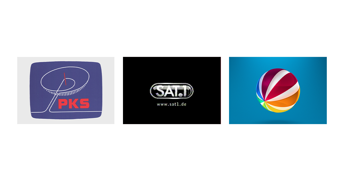
From a satellite dish to the multicoloured ball – The SAT.1 brand development from 1984 until today
by Alexandra Runden, Eyes & Ears of Europe
When did the "Programmgesellschaft für Kabel und Satellitenrundfunk" (Programme Company for Cable and Satellite Broadcasting) become SAT.1? Which changes eventually led to the multicoloured ball? And how did claims and jingles change during this time? These and many other questions were answered by André Otto, Creative Director Design and main designer responsible for the SAT.1 brand, Michael Sundermann, Head of Art and Design ProSiebenSAT.1, and Paul Taylor, Head of Audio and Creative Director ProSiebenSAT.1. In addition, former Creative Director Ulla Gessner commented on the development. Here is part 1 of the series "Brand development over time" on the occasion of the 25th anniversary of Eyes & Ears of Europe.
The history of SAT.1 began almost 40 years ago. In 1984, the channel came into the world under the name "Programmgesellschaft für Kabel und Satellitenrundfunk" (Programme Company for Cable and Satellite Broadcasting) – only to be renamed immediately one year later. "On the one hand, the name for the TV channel was very clumsy and, on top of that, not very entertaining," says André Otto, brand manager SAT.1. "That's probably why it was logical to do the first relaunch right away in 1985." A competition involving RTL and SAT.1 for the honour of being the first private satellite channel is also said to have encouraged this development: "That's probably where the 1 in the name comes from, because SAT.1 won and was indeed the first private satellite channel in 1985.“

With the first relaunch and the renaming, the acronym PKS not only disappeared from the logo, but the satellite dish, initially chosen more out of pragmatism, was also developed further. The colourful ball we know today was still more of a circle here and thus still resembled the abstracted satellite dish, but that would change just another year later. "Back then, in 1986, two people are said to have met in the Leo Kirch Studios in Unterföhring to work on a new station identifier," Otto continues. "At that time, the studios had an incredibly expensive new effects unit. It was called 'Mirage' and could produce three-dimensional image effects, which was something really great and new at the time. However, because there was no real picture material available, they simply took the test image - and if you put a 3D effect on these colour bars, you are very close to the SAT.1 ball. So that' s the origin story of the SAT.1 ball, as it was passed on to us."
Whether plain, colourful, glossy or flat – the ball stays
Since the ball and the name SAT.1 have been a unit since 1986, there have already been nine different colours and designs of the ball. "I think we've had more logo redesigns than almost anyone else," Otto assumes. In retrospect, it is not entirely clear why this came about, since the station only joined the ProSiebenSAT.1 broadcasting group in 2009. It is likely that the changes were partly due to changes in management, the brand manager continues: "At SAT.1, there was always a lot going on in the background. For example, changes in management were almost always accompanied by a redesign." Of course, global design trends were also often adopted, as well as the current zeitgeist, which was to be integrated both in terms of programming and content.
"These trends, such as skeuomorphism or flat design, have spread everywhere in brand design. Accordingly, a brand that is as deeply anchored in society as SAT.1 had to follow this development somehow," speculates Michael Sundermann, Head of Art and Design. "At least it couldn't resist it. Whereby it's only natural that you adapt to your surroundings to a certain extent and always move with the times." However, there was never a really big revolution in which the logo was no longer recognisable, because the station has remained true to its ball since 1986.
"Nonetheless, at the beginning of the 2000s it was absolutely necessary to develop a design language that would present the SAT.1 brand in all media of the future," adds Ulla Gessner, former Creative Director SAT.1. "And that was despite the fact that the first smartphone had not yet been invented. As a competitor of RTL, SAT.1 had to clearly communicate that the channel had more to offer than just being 'cuddly'." For this reason, Jobst Eversmann's SAT.1 marketing team developed a new brand communication together with Springer & Jacoby and also created a new design in cooperation with Velvet. "The SAT.1 ball as an unmistakable symbol of the broadcaster was completely modernised in the process and given a new multi-layered life with rough edges using an innovative application."
From the Wheel of Fortune via "Nur die Liebe zählt" ("Only Love Counts") to the SAT.1 Film Film – the ball becomes a brand
While the ball sometimes lost some of its lamellae, and then got more in addition, and while the colours sometimes became more, sometimes fewer, the image of the channel SAT.1 changed as well - it became a brand. Once again, the logo pointed the way: "I believe that the invention or discovery of the SAT.1 ball in 1986 set the stage for actually establishing a brand," explains André Otto. "After all, the ball is still a figurative brand with an incredibly high recognition factor and an awareness of over 90% in the market! That's why we have reached the point today where we no longer need to combine a word mark with it. Because our ball is strong enough on its own, so that the viewers recognise SAT.1 only because of it. So you could say that the ball, as a striking symbol for the channel, formed the basis for the SAT.1 brand."
This, however, was only really possible after the station moved from Berlin to Munich. The former colleagues in the capital are said to have taken exception to the "little ball": "SAT.1 was often described as the "little ball" station. The colleagues in Berlin didn't like that at all, they wanted to distance themselves from it," reports André Otto. "That's why we were instructed in the redesign not to play too much with the ball, because that would come across as too sweet, too childish and a bit degrading."
Michael Sundermann takes a different view and adds: "The colourful ball automatically has a friendly character because it is 'childlike'. It goes straight into a familiar direction and, as a colourful, friendly logo, it naturally has a much more emotional effect than such a blatant duplex logo or even a monochrome one. I think it's normal that when people work with something for too long, they eventually say, we have to emancipate ourselves from it. But actually it's just right to stick with it, because that's what's distinctive for the viewers, and of course they don't mind it. And that's why it's good that the ball has stayed."
The fact that the colleagues in Berlin wanted to move away from the "childish" colourful ball can be seen in the logo development before 2009: The ball actually became monochrome from 2004. Red and white remained the only colours. It was only with the move to Munich in 2009 that under the claim "Colour your Life" more colour was brought back into play. "When you look at the graphic and see only the one white ball with a pink core, you probably think to yourself: That doesn't fit so well with 'Colour your life'," jokes André Otto. "But you have to know that this ball came in eight or ten colours. It was not only filled with magenta, but also with turquoise, green, yellow and so on. You could feel 'Colour Your Life'." Colouring the spaces between the slats was therefore the first step back to the friendly multicoloured ball. The final commitment to the brightly coloured wheel followed in 2017: the colours returned to the outside again and have been appearing on the slats of the ball ever since, with an overlaid shine that is both entertaining and high-quality.
Not only visual, but also auditory recognition
In addition to the ball, there were of course other ways for SAT.1 to increase its recognisability. In addition to the striking, likeable claims such as "Ich drück' dich" ("l hug you"), "Die beste Zeit des Tages" ("The best time of the day") or "Freut euch drauf" ("Look forward to it"), SAT.1 also sneaks into the minds of viewers through the audio logo. "However, this didn't exist from the beginning, because from 1984 until around 1995 SAT.1 didn't have an audio logo at all," explains Paul Taylor, Head of Audio. "It wasn't until 1996 that SAT.1 had its first audio logo, which was designed by the American composer Dane Blair. It was only on air for one or two years because it was quite bulky and very difficult to work with. The audio logo as we know it has been around since 1997.“
The current audio logo has been around for 24 years, but that doesn't mean there haven't been attempts to change it completely. "I alone must have created 28 or more SAT.1 audio logos since my beginnings at the station, which may or may not have been better. But in the end the decision was always made - including by myself: No, we'll stay true to ourselves and stick to this well-known 4-tone episode," admits the Head of Audio. For almost a quarter of a century, SAT.1 has stuck to its audio logo, only changing and adapting its tone again and again. "But even then we returned to the original sound again at times five years later. There were two phases in which it was just a pure piano and in between we always tried to be modern with some synthesizers and such," Taylor recapitulates. "Now the logo is so well known that we can be quite playful with it and re-record it with different instrumentation each time depending on the mood, music or theme." This loyalty to the audio logo is also a unique selling point of the brand, because others have already changed their auditory logos several times in this period, emphasises the Head of Audio in conversation.
"SAT.1 is Germany"
Since SAT.1 went on air as the first private satellite channel, a lot has happened: The channel moved from Berlin to Munich, lost its colourfulness in between, but never its ball and finally became a brand (not only) because of that. You can see how much SAT.1 is actually interwoven with the German television landscape in the colleagues' personal first memories of the station. For Michael Sundermann, these begin around the middle of the 90s: "I can definitely still remember the logo, the striking Futura, the typeface with the pointed letters. In addition, there was the round circle or the round ball and, very importantly, the 'Film Film'. I still have that in my head. For me, SAT.1 was one of the big 'cool stations' at the beginning, because it showed the big film spectacles that were not to be found on the public stations. That's why SAT.1 was one of the 3 or 4 cool channels that existed at the time and why it was firmly stored in my memory.“
André Otto's first contact was even earlier: "When SAT.1 or PKS went on air in 1984, I was 10 years old and I couldn't watch the channel at all because I grew up in East Germany. I had my first contact with the station shortly after the fall of the Berlin Wall, when satellite dishes gave me access to West German television. Because I already knew that my studies, which were to begin at that time, would be in the area of television or motion design, I also researched in this direction and the SAT.1 image with this pill, the pill-shaped framing of the word mark, stayed in my head. That was also the time of Harald Schmidt, which was of course watched. I think the claim back then was 'Ich drück dich' ('I hug you'), which was somehow very distinctive. It was often ridiculed, but I think it still has something extremely likeable about it. Everyone knew it back then.“
Retroperspectively, a lot has changed since then, but the channel has also remained true to itself. "SAT.1 has a good mix of continuity and change. You only have to think about the fact that there are programmes like ''Frühstücksfernsehen'' (breakfast television). It's been around almost since the beginning and is still incredibly successful today," sums up André Otto, Creative Director Design, referring to the show's 33rd anniversary. "Nevertheless, you can also see from the logo history how many changes the channel has already gone through. So as I said, great continuity, despite an incredible number of changes. That's what makes the station for me." And this continuity is something special, as his SAT.1 colleague Michael Sundermann concludes: "SAT.1 is Germany, German television, German culture. For me, SAT.1 is Germany."
Further articles
- BRAND NEW Creates the ZDF Sportstudio Campaign for the FIFA World Cup 2026
- FEEDMEE and Kürten & Lechner create new AI-Based Retail Concepts
- Then We Take Berlin: Streaming First. Campaigns That Deliver Impact.
- Seven.One Studios Bundles Innovation Under the brAInbox Label
- 2know.agency takes over “Vogelsang Digital erleben”
- Screenworks develops show design for the Pumuckl show