


News
25.01.2024
Design relaunch: Orange Heat creates new accents for ZDF sportstudio
by Eyes & Ears of Europe
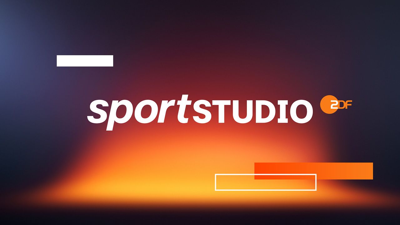
ZDF sportstudio is underlining its quality standards in cross-platform sports reporting with a comprehensive relaunch. The Hamburg-based creative agency BRAND NEW is taking charge of the development of the branding package. At the beginning of December, the current sportstudio, other regular programs and the sportstudio live series with winter sports were launched - the European Handball Championship is currently also running with the new look and feel.
In addition to previews and trailers, the graphics system for almost all on-air applications and the media set recordings have also been updated. Toolkits now ensure standardized branding of media formats and documentaries. The conceptual foundation is Orange Heat - a robust and striking branding framework in terms of design and content.
"We want to strengthen the ZDF brand sportstudio and make the brand world associated with it more tangible and tangible," says Stavros Amoutzias, Team Leader Brand and Design in ZDF Communications. Project manager Simone Rödig adds: "In terms of typography, we relied on the ZDF corporate font and a striking use of the Orange Heat color gradient - in line with our design strategy, which is clearly visually linked to the ZDF family brand."
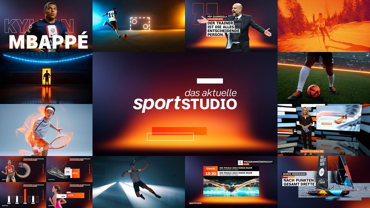
Orange Heat is the sum of all conceptual parts and consists, among other things, of a new design aesthetic for trailer and opening credits productions, specifications for the use of the corporate color orange, an accentuating impulse effect and visual constants such as the targeted use of day/night contrasts.
Kim Schwaner, BRAND NEW: "Our task was to develop a highly flexible design package that was as adaptable as possible to the wide range of sports with their equally wide range of broadcast and playout formats. In addition, our seemingly contradictory requirement was to honour the emotional level of sport in its many facets, which cannot be encountered with a rigid and conventional approach."
In addition to the conceptual framework, Simone Rödig emphasizes the challenges at the design level: "The graphic system builds on the experience and design constants of the BRAND NEW online package, which has proven itself under the most difficult conditions - small screens, little attention, very high information density - in social media."
"It dispenses with rigid layouts, adapts responsively to all applications and is optimized for the greatest possible clarity and comprehensibility," adds Kim Schwaner.
ZDF: Thomas Grimm, Stavros Amoutzias, Simone Rödig
BRAND NEW: Kim Schwaner, Michael Kruse, Florian Becker, Nicolas Arnold
Further articles
- Intermission Film joins Eyes & Ears of Europe new
- How AI and Streaming Are Transforming Media Production new
- BRAND NEW Creates the ZDF Sportstudio Campaign for the FIFA World Cup 2026
- FEEDMEE and Kürten & Lechner create new AI-Based Retail Concepts
- Then We Take Berlin: Streaming First. Campaigns That Deliver Impact.
- Seven.One Studios Bundles Innovation Under the brAInbox Label