


News
20.04.2021
Glad it worked out with "Studio Schmitt" – Cologne Bureau Etienne Heinrich takes over the design of ZDFneo's personality show
by Eyes & Ears of Europe
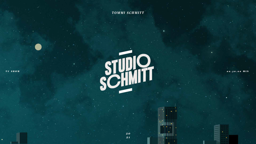
It all started in the living room and ended up in a glossy magazine – "Studio Schmitt" is the result of a collaboration between Büro Etienne Heinrich, Seapoint Productions and ZDFneo.
Since 8 April 2021, podcaster Tommi Schmitt has his own weekly personality show on ZDFneo. In a mix of black and petrol with yellow and white accents, the design of the studio comes across like a late-night show, but at the same time like a cosy living room. With LEDs in the background that can be used for different clips, the studio is versatile and features visual elements that are more popular in glossy magazines. "Our wish was to give viewers the feeling of treating themselves," says Etienne Heinrich, managing director of Büro Etienne Heinrich. "Like when you go to the train station a couple of times a year and you buy a magazine for €13.90, which is normally too expensive for you, but you know it's well designed. Then you smell it and it smells like printer's ink and the magazine has a lot of space, it's graphically well done. We thought it would be nice if the viewers had that feeling when they watch the show."

More show, more late night, more power
"In the end, we had to fight quite a bit for the typography," Heinrich reveals. After all, the designers fell in love with Formula Consended right at the beginning of the project. "The font is characterised by the fact that you can mark individual letters and make them very extended. This looks quite attractive, especially with graphic and symmetrical letters, such as the O and C in the logo. But since the typo lacked ZDFneo, we had to give it another shot, and had several options." They found the solution in the 12-degree tilt of the ZDFneo corporate design, which they applied not only to the logo but also to other graphic elements. The angle also led them to use the floating text typeface Sectra: "This serif typeface caught our eye because it is always cut at the top and comes very close to ZDFneo's 12 degrees in Italic. The combination of this finely cut calligraphic style and the bold headline type definitely pops." The special typography is not only found in the logo, but also in the unique lower thirds. These are placed half-sided over the image and make the design look like an open magazine. Radical and unique.
Four months of good cooperation
After a pilot, the briefing followed at the end of 2020, the development of the studio and graphics began in January 2021, and the set construction started in March. In addition to Etienne Heinrich, Benjamin Zurek and Jonas Röck, who were responsible for graphics and design and the whole world of "Studio Schmitt" respectively, Dirk Behrendt, Mediastyles, worked on the studio as an architect. "The cooperation with all the trades actually worked quite well. Also with lighting and direction, for example, who always have a lot to say and bring a lot of input. The director, Johannes Spiecker, has always supported us and taken our ideas even further - especially regarding the studio, the lighting and the camera." Etienne Heinrich reports on the collaboration. "We quickly created a working atmosphere that was totally constructive and progressive. I had the feeling that everyone wanted to create something new and also push television a bit forward. In retrospect, I have to say that this may have even worked remarkably well."
"Studio Schmitt" is shown on ZDFneo (in German) on Thursdays at 10:15 PM. All episodes can also be found from 8:15 PM in the ZDFmediathek at https://www.zdf.de/comedy/studio-schmitt .
Further information on Büro Etienne Heinrich (Graphic & Design) can be found at http://etienneheinrich.de/ .
Further information on Seapoint Productions (production) at https://www.seapoint.de/en
Further articles
- BRAND NEW Creates the ZDF Sportstudio Campaign for the FIFA World Cup 2026
- FEEDMEE and Kürten & Lechner create new AI-Based Retail Concepts
- Then We Take Berlin: Streaming First. Campaigns That Deliver Impact.
- Seven.One Studios Bundles Innovation Under the brAInbox Label
- 2know.agency takes over “Vogelsang Digital erleben”
- Screenworks develops show design for the Pumuckl show