


News
30.09.2019
CapeRock creates new identity for Dutch TV channel Net5
by Eyes & Ears of Europe
In today's competitive media landscape it is more important than ever to be visible on all media channels, to establish a coherent brand image and a strong connection with the programme. For this reason and the strategic decision to connect Net5 to the successful Dutch women's brand LINDA, CapeRock redesigned Net5 on behalf of Talpa Network.
CapeRock worked on the redesign in close collaboration with creative director Jildou van der Bijl and channel manager Annelies Sitvast. The result is a contemporary brand with a playful and confident look. Net5 aims to inspire women to express their opinions, something LINDA has done successfully in recent years.

The channel design is made elegant and accessible through typography, motion design and a striking accent colour. "A new design is always a special moment for a channel and brand," says Annelies Sitvast, Channel Manager at Net5. "Together with CapeRock we have managed to bring the visual identities of two strong brands together in a fresh, contemporary design that has a unique character within the current media landscape. A great step in the new collaboration between Net5 and LINDA."
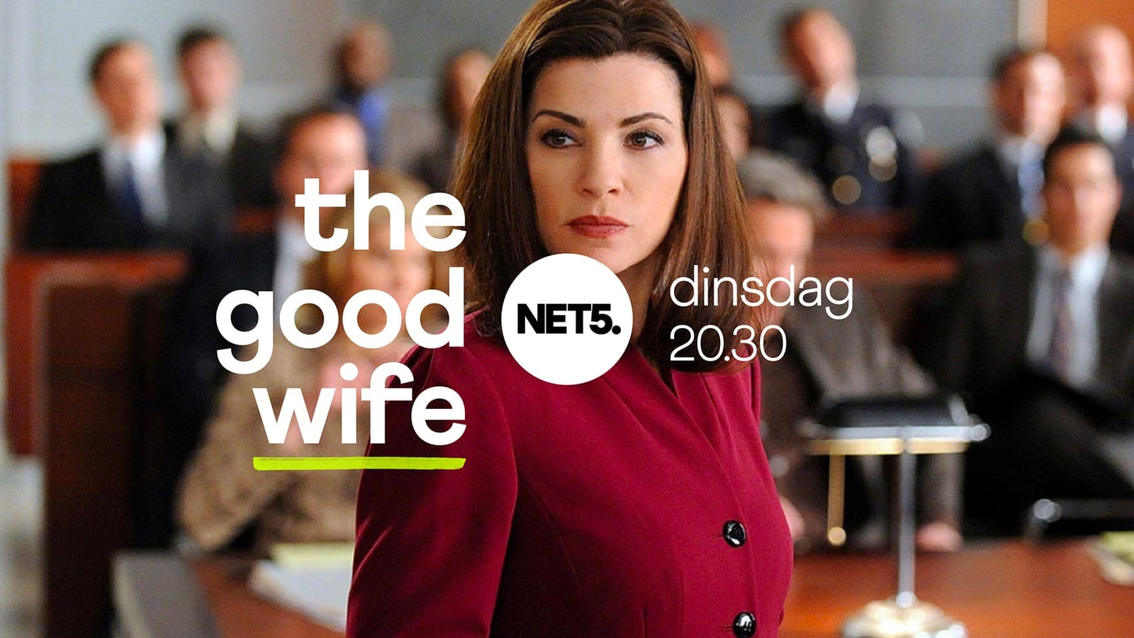
The new Net5 design was given a new logo that resembles the LINDA logo: with a dot behind Net5. Dann Smit, Creative Director at CapeRock: "The design of the logo features the sub-line" Powered by LINDA. "The logo is always centrally positioned on the channel and it opens in a dynamic way the world of programs, films and series that Net5 offers. The brand system provides an answer to the complex matter to make the visual connection of the Net5 and LINDA brands."
The tone of Net5 together with LINDA is more contemporary and the design has more power. It's a real women's channel. Jildou van der Bijl, Creative Director at Net5: "It was very nice working with design studio CapeRock. We are extremely proud of the result: a strong logo that relates to the LINDA. -logo, yet stands on its own. A visual language that fits perfectly with the contemporary and more urgent feel of the new Net5. It’s a design that underlines that we want to make Net5 the women first channel in the Netherlands.
Further information on the case can be found at https://www.caperock.tv/work/net5
Further articles
- Intermission Film joins Eyes & Ears of Europe new
- How AI and Streaming Are Transforming Media Production new
- BRAND NEW Creates the ZDF Sportstudio Campaign for the FIFA World Cup 2026
- FEEDMEE and Kürten & Lechner create new AI-Based Retail Concepts
- Then We Take Berlin: Streaming First. Campaigns That Deliver Impact.
- Seven.One Studios Bundles Innovation Under the brAInbox Label