


News
16.01.2019
SAT.1 GOLD shines in a new design
by Eyes & Ears of Europe
Just in time for the sixth birthday of SAT.1 GOLD, the station gets its first complete redesign.
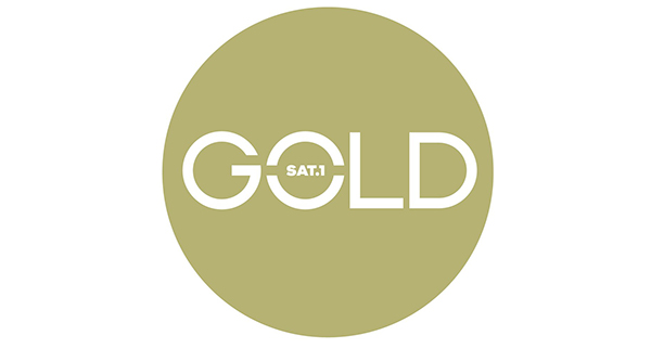
The station's previous appearance will be further enhanced, amongst other things, by a new logo. The typography of the channel logo will be rounder and embedded in a circle. Gold will remain the accent colour of the font and the logo surface, but it will be complemented by additional colour worlds: Grape Red, Ocean Green, Light Gold and Dark Blue. At the same time, a golden edge and a transparent wave pattern are introduced that separate motifs such as bumpers, labels or tips into distinct image and information areas. There is also a new audio logo. The claim "For all who see with the heart" is shortened to "See with the heart".
"SAT.1 GOLD is the most successful feel-good channel for the target group of women over 40. And they are our role models. [...] SAT.1 GOLD is now to become as colourful as the lives of these women: More lively, self-confident, courageous and with a good portion of calmness, SAT.1 GOLD is now taking a further step with its redesign," says Michaela Kiermaier, Vice President Channel Management SAT.1 GOLD.
The redesign will be used immediately on TV with a new permanent logo, new bumpers, trailers and other commercials as well as digitally on sat1gold.de, in the app and on social media. The new channel appearance was developed and implemented by the in-house agency Creative Solutions.
A video on the redesign of SAT.1 GOLD at https://vimeo.com/311853700
Tags
Further articles
- Intermission Film joins Eyes & Ears of Europe new
- How AI and Streaming Are Transforming Media Production new
- BRAND NEW Creates the ZDF Sportstudio Campaign for the FIFA World Cup 2026
- FEEDMEE and Kürten & Lechner create new AI-Based Retail Concepts
- Then We Take Berlin: Streaming First. Campaigns That Deliver Impact.
- Seven.One Studios Bundles Innovation Under the brAInbox Label