


News
25.02.2021
Design with heart – Paris agency GÉDÉON designs new Flemish entertainment brand Play
by Eyes & Ears of Europe
Not just a design, but an experience of its own, not just viewers, but fans – that were the goals of the Parisian agency GÉDÉON for Play, the brand created by the merger of the two large Belgian television and telecommunications companies SBS and Telenet.
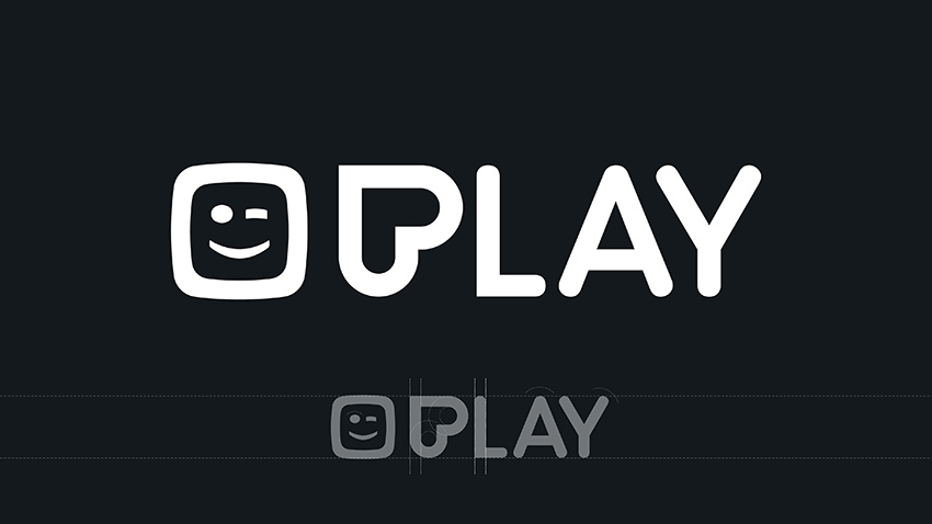
First a P, then a heart and finally the Play button – the P of Play is at the centre of GÉDÉON's design. By rotating the P, it transforms into different icons due to the clever typography. This way, the letter functions as a recognition sign for the new brand. This means that not only the app icon can be identified immediately, but also the five different channels are grouped together under one symbol.

Play for all!
The fact that Play's six channels are as diverse as their viewers is reflected not only in their programming, but also in GÉDÉON's design, as they are each given their own colour language to go with the cross-channel brand font Barlow, designed by Jeromy Tribby. Play 4 plays with the signal colour red and a responsive design to emphasize the “more than just television spirit” of the main channel. While Play5 with its iconic programme around series like "Grey's Anatomy" comes across young and full of fun in the "bubblegum" colours pink and yellow, the Parisian agency relies on a completely different colour palette for Play6. Dark blue stripes are used here to visually refer to the American blockbusters and series that characterise the programme. At PlayMore, the agency opted for a muted blue instead of bright colours, thus drawing attention to the key visuals and heroines of the films and series.
Bright colours for sports
Of course, sports cannot be forgotten in entertainment and so GÉDÉON was also asked to design the two sports channels under the Play brand. Here, the agency played with the thematically given dynamics and with the letter O in PlaySports and PlaySports Open. In yellow and bright green, the O becomes a ball and accompanies the sports-loving viewers through the sports programmes.
Play can do more than just on-air
In addition to the on-air channels’ branding GÉDÉON also developed the 360° design for all the brands that stands out on social and print media. For GoPlay the Parisian Agency went for a contrasting colour. In bright turquoise, the high-quality streaming service joins the ranks of the Play channels with its typography and functions as an entertainment.
For more information see https://www.gedeon.com/projects/play-global-identity/
Further articles
- BRAND NEW Creates the ZDF Sportstudio Campaign for the FIFA World Cup 2026
- FEEDMEE and Kürten & Lechner create new AI-Based Retail Concepts
- Then We Take Berlin: Streaming First. Campaigns That Deliver Impact.
- Seven.One Studios Bundles Innovation Under the brAInbox Label
- 2know.agency takes over “Vogelsang Digital erleben”
- Screenworks develops show design for the Pumuckl show